CenturyLink Prism TV Mobile Redesign – Elevating the User Experience
As site visits for CenturyLink’s Prism TV product soared exponentially, it became evident that the original single-page mobile experience fell short in conveying the product’s full story. To address this, CenturyLink sought a more robust mobile experience that could effectively showcase the Prism TV offering.
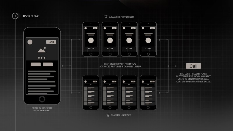
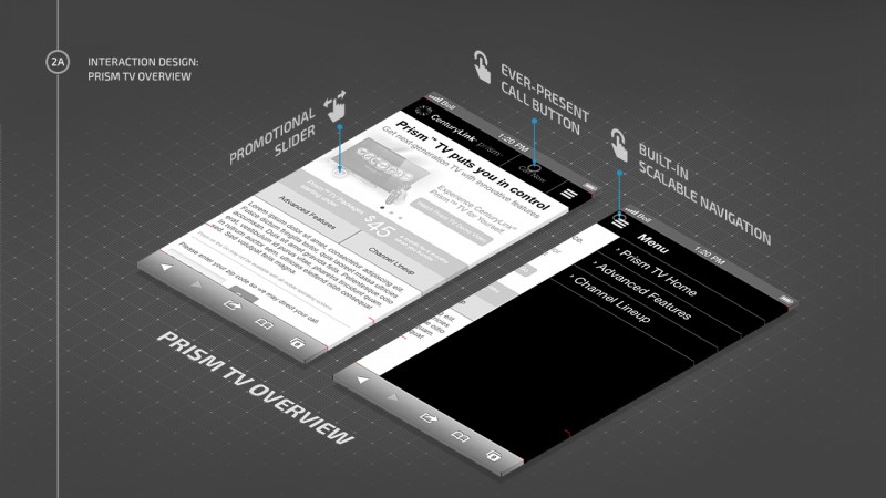
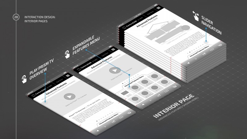
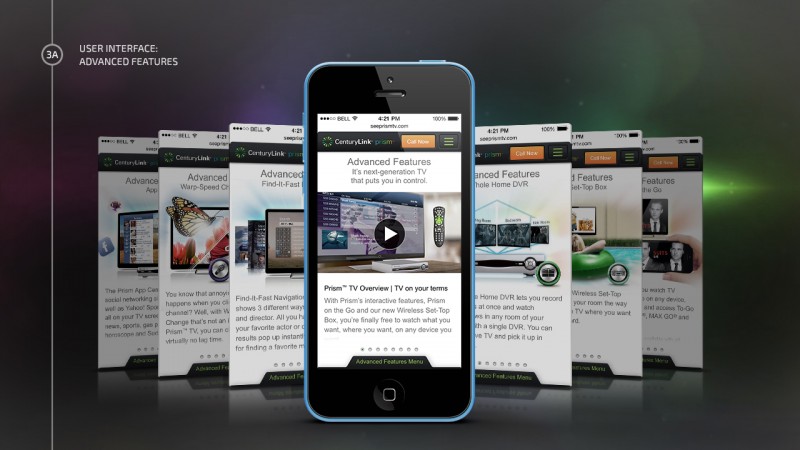
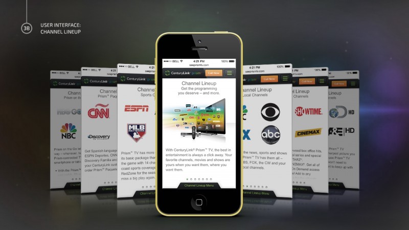
As the lead for the Prism Mobile Redesign, I took charge of the user flows, interaction design, user interface, and all the graphics. My primary focus and source of pride lie in crafting an exceptional user experience, emphasizing Prism TV’s two key differentiators: its advanced features and channel lineup. For these aspects, I created a seamless experience that empowers users to explore features and channels effortlessly. By swiping left or right, users could stumble upon exciting features or channels, while swiping up grants quick access to the feature/channel menus for swift navigation.
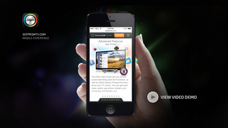
The resulting mobile redesign effectively told the Prism TV story, showcasing its advanced capabilities and vast channel lineup in a captivating and user-friendly manner.
View Video Demo

